The treatment of cancer and other severe illnesses requires service providers to look beyond physical care, to the emotional, interpersonal, lifestyle and administrative concerns that patients experience. The myriad of pain-points experienced by cancer patients, and the highly complex challenges inherent in the healthcare sector that are systemic in nature, involve multiple stakeholders. Such “wicked problems”, as known in the design discourse, create interesting opportunities for interdisciplinary engagement, collaborative methods, and design approaches to ensure a more holistic type of patient-centered care. The research and insights developed through the capstone project helped in exploring the role of design in transitions across the patient journey.
Three specific interventions were designed after discerning the opportunity areas and the different interactions uncovered through ecosystem mapping, and other methods.
INTERVENTION #1: How do patients understand the system?
The first intervention was designed to learn more deeply about the system. Questions were probed, like ‘How might we explore ways of communicating the complexity of the system and its components (or resources) to the patients’; ‘Can this be shaped in a way that makes the system feel both more understandable, but also more responsive to patient needs?’ The goal was to not only provide manageable and sticky information, but also addressing diversity of the cancer experience; ease emotional and physical adjustment, as well as facilitate giving and getting back.
In this patient-led intervention, the interaction would take place in patient waiting rooms (in case of the analog version) and patient homes and other areas outside of MSK hospital (in case of the digital version of the intervention). Design of this intervention started with the understanding of how patients were currently exposed to information and resources available to them at the hospital. It was learnt that it is the responsibility of the Patient Education department to provide patients with information on the resources offered by the hospital. This resource is in the form of an online portal, patient guides, and a set of leaflets and booklets, that live in various hospital departments and waiting rooms. Interviewed patients said that the primary source of information for them was their care team, or friends, family and fellow patients. The problem with both of these sources was evident, since the majority of patient education resources explained from the hospital’s perspective, and also, the way patients received information was found to be inconsistent. Given the prominent source of information are patient’s care team, friends and family, then each patient has access to the information given to them by the people they directly interact with, fueling the possibility of them absorbing information about resources after that could have used them, or never finding out about certain resources.
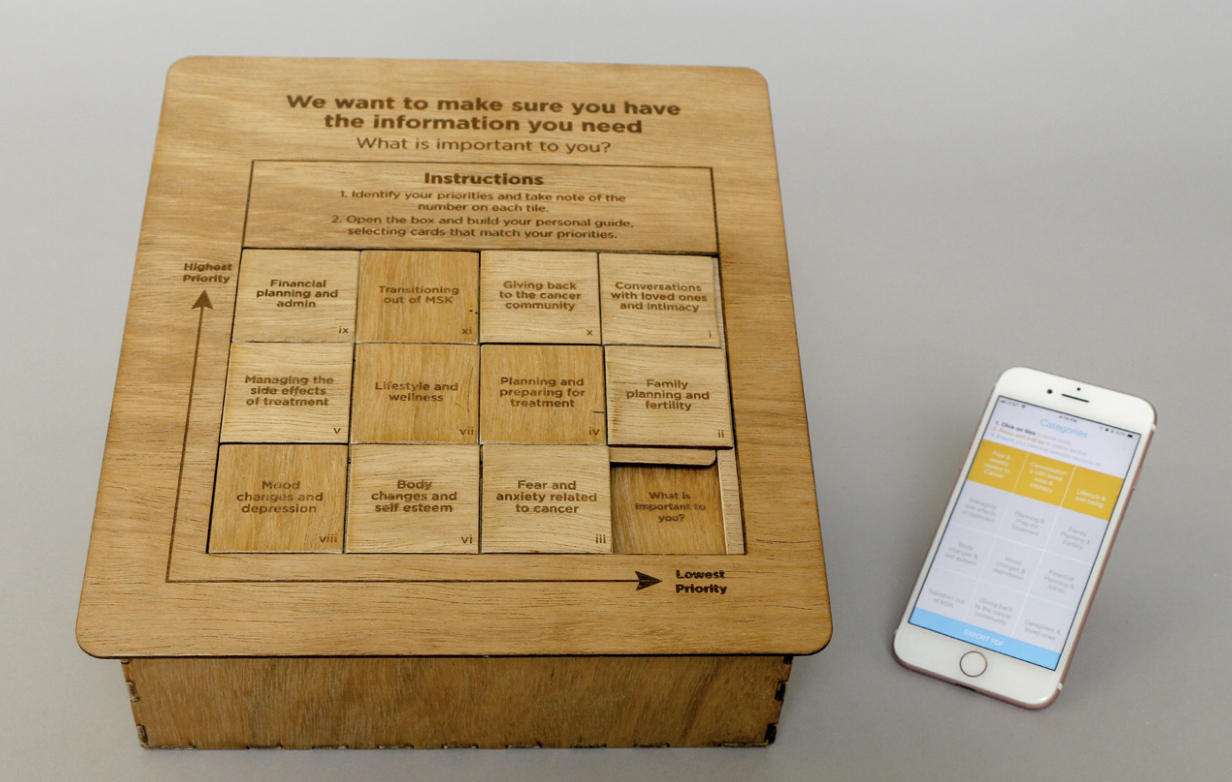
The intervention resulted in the design of a physical artifact, a Resource Kit that focussed on bringing together three elements-
- A list of things patients might be concerned about.
- The growing overview of services and resources available at the hospital, many addressing both clinical and non-clinical concerns.
- A moment of interaction – the waiting rooms all across the hospital are where patients spend significant amounts of time during the course of their treatment.
The Resource Kit box would sit in waiting rooms and be a patient-driven experience, encouraging dialogue between the patient and their loved ones. The patient would sit with the lid of the box and examine the categories presented in the tile slide. The tiles correspond to physical, emotional, interpersonal, lifestyle and administrative concerns that patients may have. They could then play the game, moving the tiles around to identify higher and lower priority interests. They would then look in the box below and create a selection of leaflets that correspond to their priorities. Each leaflet has testimonials from fellow patients, and the resources available to them that are linked to their specific priority area, and finally, some space for patients to take their own notes. This is a way for patients to create their own Resource Kit, corresponding to their individual needs.
After a series of iterative prototyping and testing, it was realized that a more tactile game generated a more engaging and thoughtful experience. Based on patient feedback, a digital version of the same intervention was also developed- the ResourceKit App, that patients could access outside the hospital. Creating a digital tool allowed for more flexibility in the way information was presented and updated over time. The guide contains audio/visual testimonials from patients, as well as links to suggested resources. The physical and digital prototypes are not intended to replace one another, but rather reinforce each other.

